
Black Hills Energy
Overview
Black Hills Energy – Service Guard Rebrand
Strategic Rebrand & Multi-Touch Campaign
Audience Reach: 1.35+ Million Customers
Awards: American Advertising Federation Gold and Silver in Integrated Brand Campaign
The Challenge
Service Guard, Black Hills Energy’s appliance repair program, wad due for more than a refresh – it needed a full repositioning. With dated branding and low awareness and program overhaul, the challenge was to bring Service Guard into the modern era as a trusted, approachable extension of the Black Hills Energy brand – while preparing the messaging and assets to reach over 1.35 million customers across eight states and multiple service territories.
The Insight
Billing data revealed that women are most often the ones managing the household utilities and enrolling in service protection programs. This insight set the tone, look and messaging of the brand – from lifestyle photography to soft-sell taglines – focusing on peace of mind, trust, and home comfort.
The Solution: A Human-Centered, Strategy-Led Rebrand
We led a compressive brand transformation, crafting a campaign that spoke to customers emotionally and practically – emphasizing protection, simplicity, and care.
Logo Design: Meaningful, Memorable, Modern
At the core of the new identity is a multi-layered icon that brings the brand to life:
- A stylized “G” for Guard is subtly integrated.
- A house shape anchors the form – symbolizing care and reliability at home
- The entire mark takes the shape of a shield, representing protection, trust and peace of mind
The logo was designed to be simple, flexible, and deeply symbolic – while aligning with the visual strength of the Black Hills Energy brand.
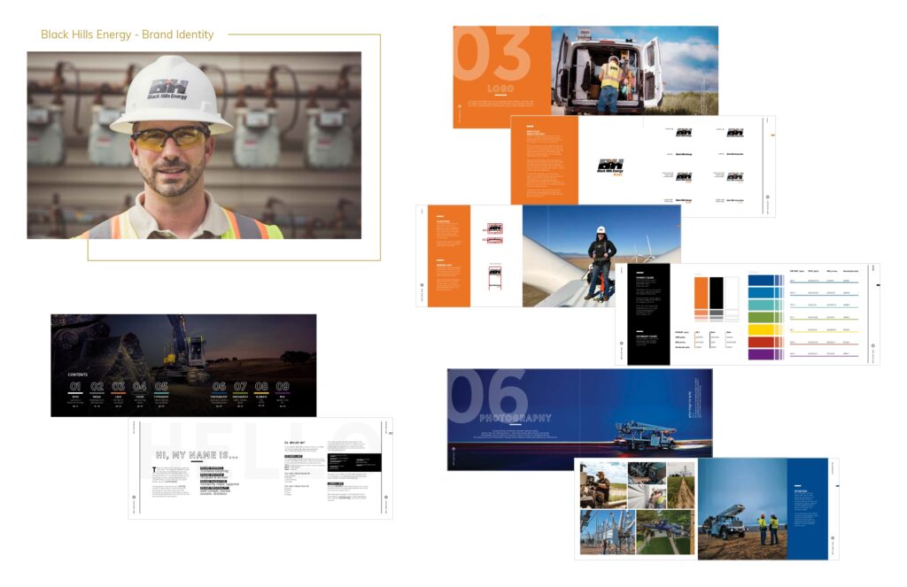
Color Palette & Visual System
We expanded the core brand palette into a softer, more calming tones – evoking warmth and reliability. These lighter hues gave the brand a more lifestyle- driven tone while still aligning with the corporate standard, derived from a percentage of the initial palette.
Lifestyle Driven Photo & Video
A directed curated brand shoot focused on everyday moments – families at ease, enjoying life uninterrupted. These visuals formed the basis for a complete content system used across all media – from welcome kits, social media, web, bill inserts, out of home and various materials.
Messaging and Voice
We developed a messaging platform centered around the emotional benefit of feeling covered:
“Peace of mind”
“Let’s stay home”
“Carefree comfort”
Headlines, taglines, and body copy all reflected a calm, conversational voice that resonates with the day-to-day concerns of real households.
Multi-touch Campaign Rollout
We built a robust suite of assets, optimized for wide-scale deployment to a 1.35 million+ customer base across digital, social print and service offices.
Deliverables included:
- Campaign playbook
- Customer welcome kit
- Web and email content
- Digital display and social ads
- Direct mail and bill inserts
- Out-of-home
- Cookbook
- Paid and organic media
- Internal rollout – assets, toolkit, training kits
- Swag and promotional items
- Fleet vehicles
Results and Recognition
American Advertising Federation of the Black Hills –
- Gold Addy Award – Cross-platform: integrated campaigns, local or regional/national, integrated brand identity campaign
- Gold Addy Award – Online interactive, social media, single execution
- Silver Addy Award – Cross-platform: integrated branded content campaign, local or regional/national, integrated brand identity campaign
Why it Worked
This was more than a rebrand – it was a strategic repositioning grounded in data, empathy, design, and excellence.
- Strong brand adoption across regions
- Boosted engagement by and signups
- Increased alignment and visibility with Black Hills Energy brand